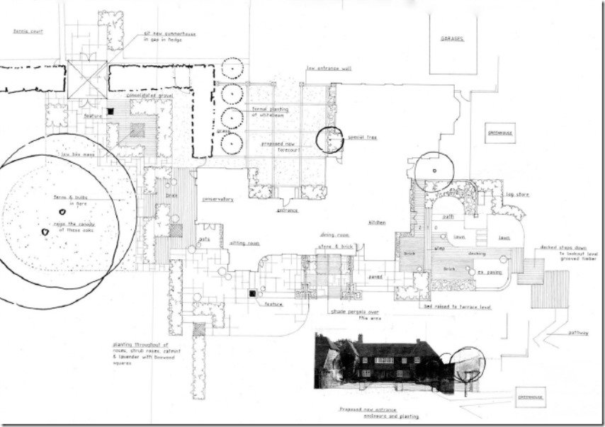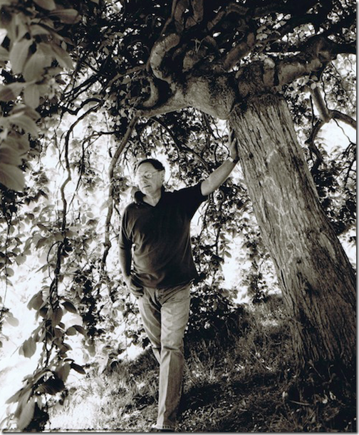
John Brookes MBE 1933-2018
John Brookes Landscape Designer passed away yesterday at his home, at Denmans Nr Fontwell West Sussex. He was 84. This article was written as a result of an interview that took place back in 2008 but was never published. It briefly documents John’s extraordinary career and why his work had such a profound influence on both my life and thousands of other landscape and garden designers. – RIP John
John Brookes -Early Influences
The response of British gardens to modernism was slow for many reasons, but was in part, due to the fashionable Arts and Crafts movement.
The English Landscape Architect Geoffrey Jellicoe (1900-96) was, in his early years, quite alone in his exploring and adopting of modern art and modernism in his designs and his growing interest in the concept of the unconscious, which he gained from the abstract art of Mark Rothko, Jackson Pollock and Paul Klee.
It was between 1957-60 that Jellicoe befriended John Brookes and encouraged his interest in modern art and the works of expressionist artists such as Willem de Kooning, Ben Nicholson and Piet Mondrian.
John Brookes started linking colours, shapes and patterns to planting plans and the allocation of space and strength of shape into garden designs.
It was about this time that Thomas Church sent a copy of his book “Gardens are for people” to Sylvia Crowe.
Brookes, who worked for her, saw and read the book and was impressed and fascinated by the simple line drawings, with their geometry forming shapes and contemporary patterns reflecting the modern and contemporary feel of the artists he had been following.
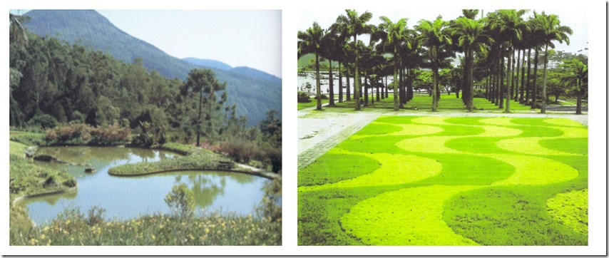
In Brazil, it was Roberto Burle Marx (1909-1994) that was an influence on John. His use of new materials such as natural stone and concrete and also his abstract designs.
Burle Marx had worked with modern architects such as Oscar Neumayer to ensure that his landscapes were the perfect complement to the buildings.
His use of plants best suited to the climate gained him a unique status in the history of garden design but also his use of texture, shape and colour was original.
He was trained as a painter and often created planting plans as if they were paint on a canvas.
The biomorphic forms as seen in the works of the Surrealists and early works of the Abstract Expressionists can be seen in his lake at Kronsgorth (above). The lake with a promontory, set on a hillside where it repeats the shapes of the highlands beyond.
In 1962 he entered a design into a competition run by the Institute of Landscape Designers, for a design to be built for the 1962 Chelsea Flower Show.
Winning the competition, Brookes became the first independent designer to have a garden exhibited at Chelsea, rather than by a nursery.
The design utilised new materials such as cement, concrete and asbestos and showed how they can be used harmoniously within the garden environment. The garden was sponsored by the Cement and Concrete Association, so pavings, level changes and structure are all in concrete.
The simple outline of the ‘pavilion’ is intended as more of an eye catcher than a retreat. The layout is squared and very simple, quite radical at the time!
The planting was of a limited palette but en-mass, emphasising that plant masses are important but the individual plants making up the masses are not.
He was awarded a silver medal by the Royal Horticultural Society (RHS).The design, differing from the usual box like format of terraced houses. the use of new materials and a low maintenance design increased his reputation as a modern designer and gained him many more commissions.
New Thinking in Garden Design
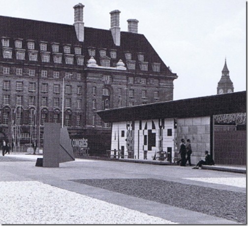
Brookes was interested in the integration of art and architecture and in 1961 Theo Crosbyʼs uncompromising constructivist design for the long low conference buildings for the International Union of Architects Conference enclosed a courtyard laid out by Brookes with an Anthony Caro bolted iron sculpture as its centrepiece.
Stimulated by the success of this first collaboration and with his ready appreciation of modern art and realisation that most architects gave little serious consideration to the spaces between and around buildings Brookes was the perfect partner for Crosbyʼs writing.
Crosby and Brookes were interested in how painters and sculptors could be brought in to more meaningful relation to architecture. Brookes’ contribution landscape design dealt with the importance of designing a building as an entity in harmony with their surroundings as seen in Christopher Tunnards’ design, for Bentley Wood.
Brookes writing revealed a wealth of knowledge and confidence, he intended to educate architects, included the use of plants in design –
“plants can be regarded as an artist would his oils, to be used after he had prepared his outline sketch and worked out proportions, the aesthetics and practicalities of ground shaping, the creative use of textures and surfaces –
ʻThe continuation of a building line form vertical into the horizontal, done if possible in the same material stabilises the building and links it into its surround; and the creation of an
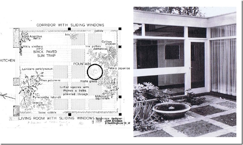
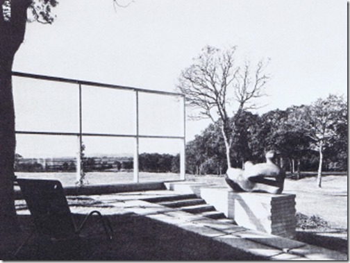
ʻintimateʼ outside place”John Brookes design for Michael Manser House 1961
Brookes changed the way people think about their gardens transforming them from a place to display plants to a stylish outdoor room. He was able to promote the concept of the outside room and achieve publicity for his growing practice when in 1961 his design for the garden of a new house by rising modernist architect Michael Manser (above) featured in Architectural Design, giving him a reputation of being a designer of “Modern Gardens.”.
With glass walls on three sides and sliding doors from the living room, the architectural design of the courtyard was complemented by Brookesʼ strictly geometric ground patterning of brick infilled in part with grass and planting.
John Brookes Chelsea Flower Show Design 1962
Although still at an experimental stage in his career, John Brookes method of designing the garden in proportion to features of the buildings provided what Jellicoe called a unifying ‘sense of abstract design’ and became the foundation on which Brookesʼs future work was built.
In 1962 he entered a design into a competition run by the Institute of Landscape Designers, for a design to be built for the 1962 Chelsea Flower Show. Winning the competition, Brookes became the first independent designer to have a garden exhibited at Chelsea, rather than by a nursery. 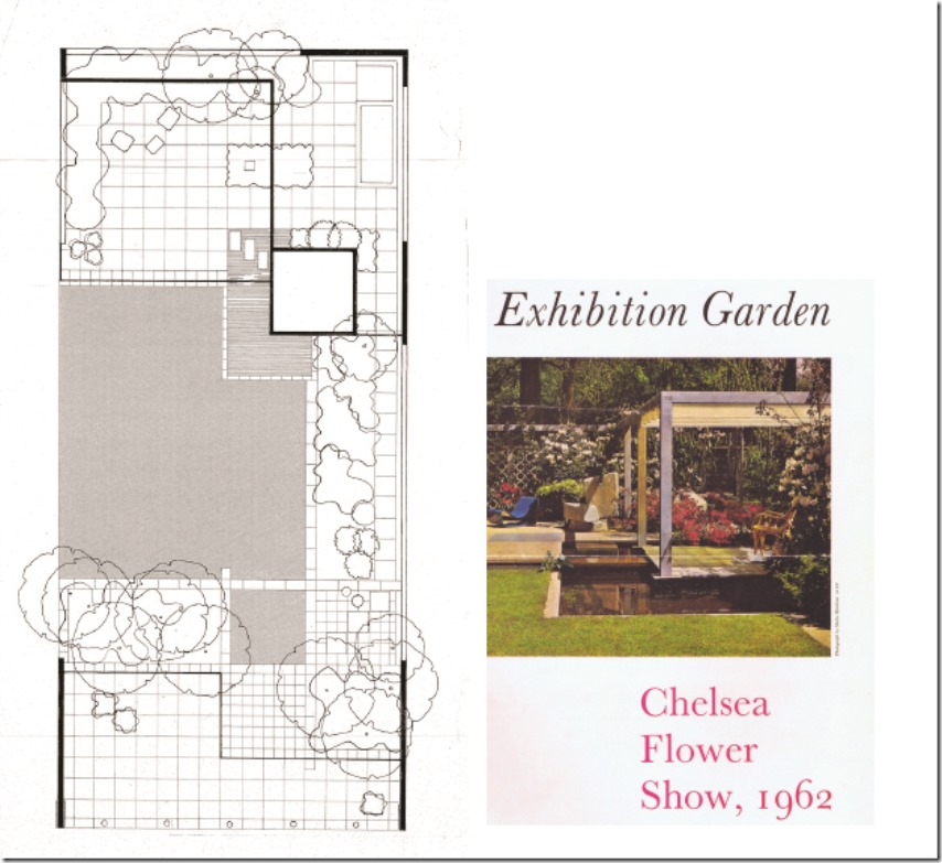
The design utilised new materials such as cement, concrete and asbestos and showed how they can be used harmoniously within the garden environment. The garden was sponsored by the Cement and Concrete Association, so pavings, level changes and structure are all in concrete. The simple outline of the ‘pavilion’ is intended as more of an eye catcher than a retreat. The layout is squared and very simple, quite radical at the time!
The planting was of a limited palette but en-mass, emphasising that plant masses are important but the individual plants making up the masses are not. He was awarded a silver medal by the Royal Horticultural Society (RHS).The design, differing from the usual box-like format of terraced houses. the use of new materials and a low maintenance design increased his reputation as a modern designer and gained him many more commissions.
John Brookes design for the Gimpel house London 1964
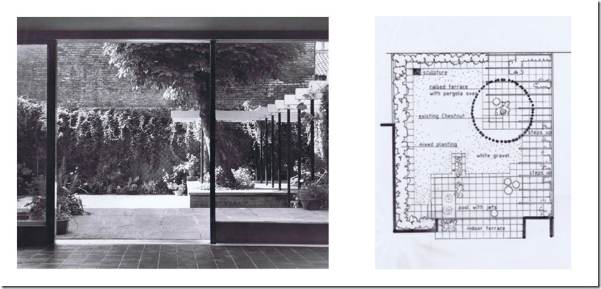
For the Gimpel house, London, 1964, Brookes favoured a pergola to create a formal outdoor space adjoining the house and by 1964 he had abandoned the traditional wooden or masonry verticals for a versatile, light structure of scaffolding poles, often painted black, with narrow white softboard horizontals, well suited to the small town garden. It became a feature of his 1960ʼs town gardens.
In Madame Gimpelʼs garden he used the pergola with white chippings, blue-grey concrete, ochre-painted walls and white latticework to create an integrated living room and garden, extending the living space both physically and visually. In 1969 John published his first book, Room Outside – A New Approach to Garden Design, it promoted the concept of the garden as an extension of the house.
Brookes emphasized that the designers’ remit was to create a garden to reflect its owners way of life and tastes rather than being an expression of a designers work. But also that it should be at one with its surrounding. He described landscapes as a type of sculpture – a manipulation of space, heights, levels and contours – in earth, hard materials and planting.ʼ He developed the garden as an abstract art form.
John Brookes Penguin Book Garden
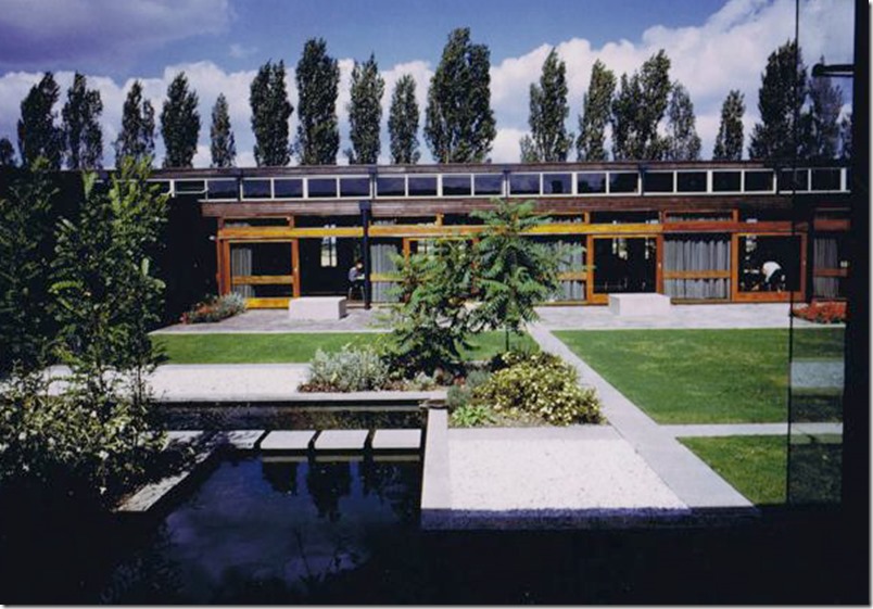
In 1964 Brookes was asked by architects John Spence & Partners, who were designing the extension to the factory building for the newly become public
company, Penguin Books, to design the canteen courtyard and the Directors courtyard. His brief being to design both courtyards complete with planting plans and also the front of the building.
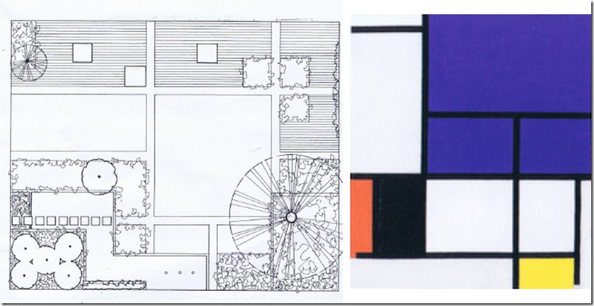
The two courtyards were separated by a covered walkway leading to the canteen and were visible through big plate glass windows on all sides. The design for the canteen courtyard was based on the building module, creating a strong rectilinear pattern, it comprised of geometrical shapes of water, planting, paving, grass and white chippings.
The use of an underlying abstract theme, considered to be reminiscent of a Piet Mondrian painting attracted public attention and was seen as a symbol of modernity. The finished plan clearly shows the Mondrian inspiration with the abstract design complimenting the modern architecture perfectly.
Mondrian believed that horizontal and vertical lines, initially based on a grid, were the best means to achieve and convey harmony in art. He introduced strong colours into the individual sections of the grid, enclosing each section with bold vertical and horizontal lines to increase ʻtheir special quality, their atmosphere and visual impactʼ. Like Mondrian Brookes also provides structural integrity to his designs using a grid to produce the pattern of spaces that are later assigned function. He recalls;
“I saw from my time at Architectural Design that thereʼs a discipline within the design of a building and I thought why canʼt that also work outside? I was aware of Mondrianʼs paintings and , indeed, Sylvia Croweʼs designs on which I had worked had a touch of Mondrian in them. The press liked the idea that the Penguin garden had a relationship to the square shapes of a Mondrian painting. It was an early example of a new way of designing a garden pace…..and the first of mine to get notoriety! It was a combination of a use of different materials, a squared pattern, a terrace, sliding doors and a room outside, as well as plenty of planting”
John Brookes Financial Time Garden Chelsea Flower Show, 1972
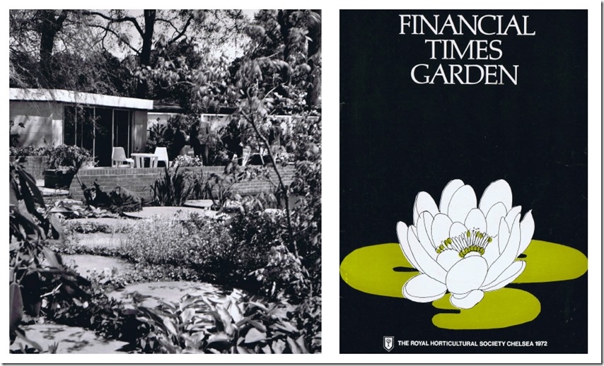
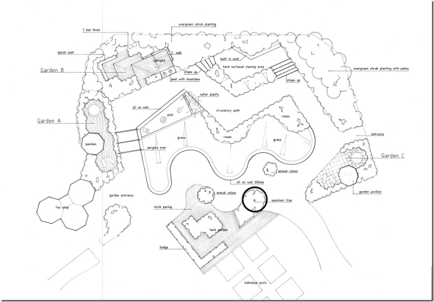
The garden plan for the 1972 Financial Times Suburban garden at the Chelsea Flower Show was intended to break the mould of the rather traditional garden layouts usually exhibited.
A good proportion of the allotted site was a pool and through it circular cast concrete pads led to a terrace which was slightly higher. In one corner of the terrace was a garden room, mono pitched and overhung by a weeping willow.
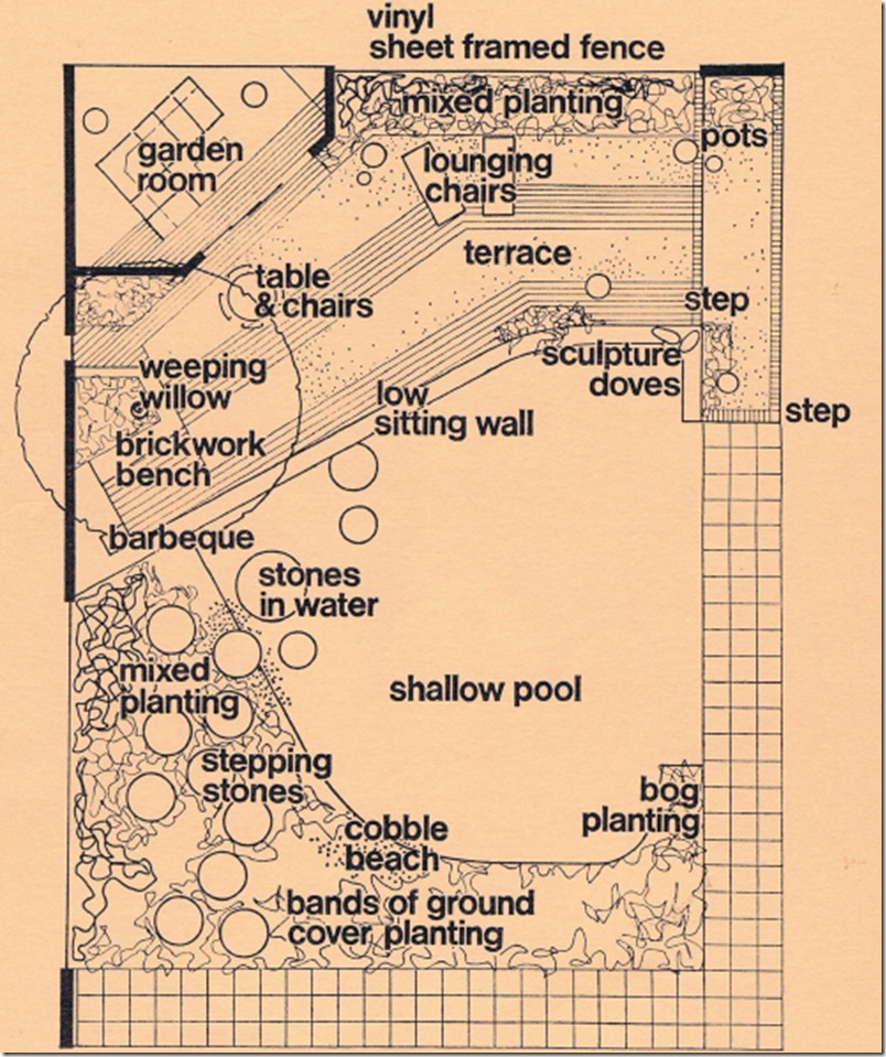
A low brick retaining wall to the terrace ended at the further end with a sculpture of Two Doves again in concrete designed by Marie Gill.
John had proposed white fiberglass Panton chairs by Robert Venturi for the terrace but the chairman thought them too avant garde for Her Majesty to view and they were replaced by wooden ones.
Much of the planting around the pool was perennial with strongly architectural foliage to contrast with the built shapes of the design.
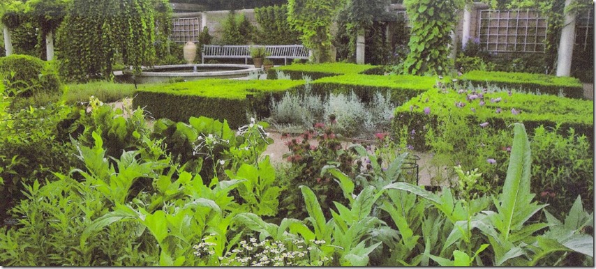
Chicago Botanic Garden, USA, The English Walled Garden, 1986
John’s brief was to design a traditional English garden but reluctant to design a pastiche garden in the manner of Sissinghurst. Brookes proposed linked garden rooms that would highlight aspects of English garden design through the centuries.
Brookesʼs sketches and drawings trace the development of his design concepts from early experiments with underlying pattern to the outline garden plan. Completed in early 1988, the rectilinear design on several levels takes advantage of the sites slope towards a lake.
The English Walled Garden was awarded the Horticultural Society of Chicagoʼs Hutchinson Prize in 1998.
John Brookes Design for the garden exhibition Osaka, 1999
A garden exhibition – hopefully to become a permanent park (it didn’t), was located next to a funfair site with a big wheel and helter-skelter. “My main pool pattern was seen against this backdrop, with surrounding scaling and display areas.”
John Brookes
Patagonia, 2003
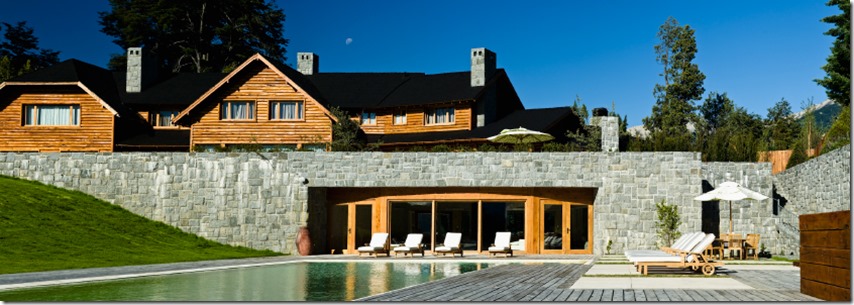
This part of Argentina in the foothills of the Andes is known as little Switzerland. A new house in the local wooden idiom is sited facing water in both directions. The ground falls away sharply to the main lake, allowing a gymnasium to be sited beneath one end of the house.

I needed to work using wood as well, though in a modern idiom. Taking my grid from the proportions of the entrance portico, the front access is of timber squares with a granite sett infill. The top terrace at the rear of the house is of a sett pattern with a wooden infill, interspersed with standard apple trees for summer shade.

At the lower level outside the gym and surrounding an infinity pool, the pattern is of grass with a textured flagged surface in between.
The grid created continuity in the design concept, though realised with different materials at each level.”
John Brookes
A Walled Courtyard Garden 2004
A tiny walled garden, completing the rectangle of an L shaped new build house. The owners wanted to use the space whenever weather permits, but hate direct sunlight.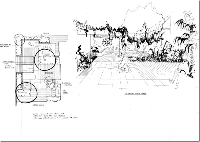
Where high walls tend to make one look up and out a strong ground pattern is necessary to hold the eye down. So the brick of the house along with a sympathetic paving provides the modulated pattern to this garden.
The ground pattern is further strengthened with strong foliage forms and plant shapes.
The ownerʼs daughter added an art work to further enliven this Room Outside.
Chiselhampton House 2004
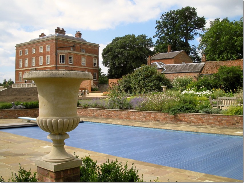
This house in the Midlands dates from 1768, it is therefore a listed building and its surroundings had to be approved by the appropriate authorities. The clients requested good user friendly entertaining areas, a flower garden and a remodelling of the terrace around the house.
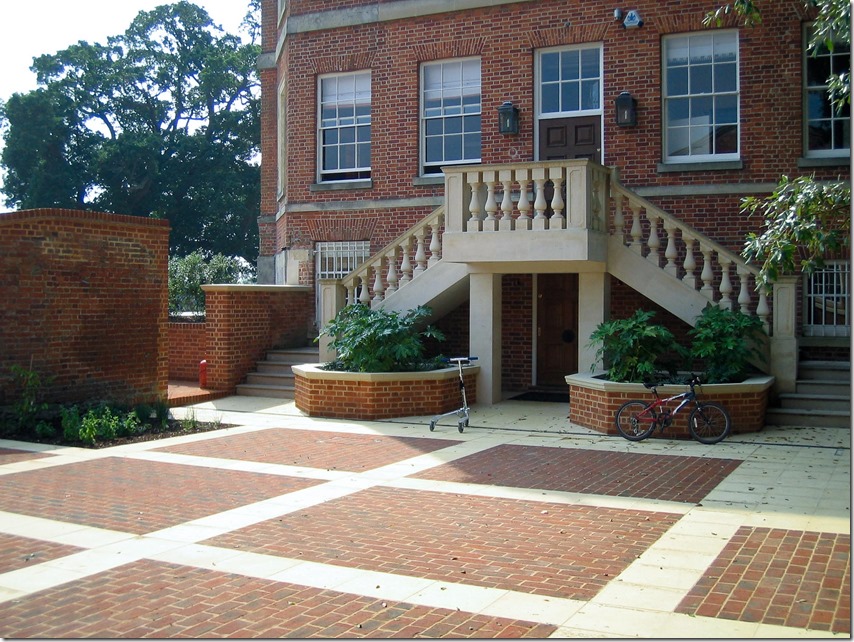
The site needed much tree planting to organise the views and generally give the surrounding oak studded grassland an upgrade. The first task was to visually lower the house on its south side. By proposing a 1.5m high retaining wall along the south side of the house and grading up to it, half a storey was lost and light still got into the sub basement. This was then joined by a new balustrade to the main terrace. 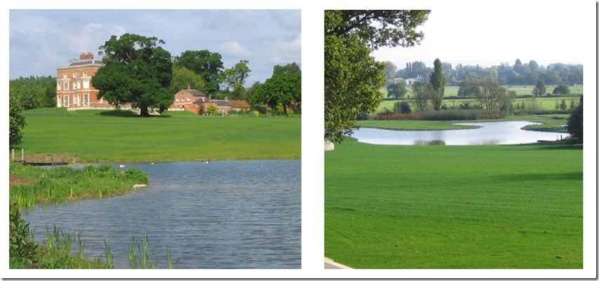
Although the lower part of the ground surrounding the house was bordered by a river it could not be seen from the house so a lake was suggested. The completed lake (above) nestles between giant oak trees at the bottom of the hill. From inside the house the view to the lake is uninterrupted by the new retaining wall on the bank around the house.
John Brookes design for Bosham Hoe Sussex 2007
Each aspect of this house affects the paved areas it adjoins. It is a large property so it can take it, it faces the sea. The house is used for entertaining, so hard areas are necessary, but they are then scaled down with sympathetic planting.
John Brookes curvilinear design 2008
This later layout of 2008 still clearly shows some of the geometric rules that Brookes always follows. Rule of thirds, evidence of design scale from his grid system, geometric design principles and loose flowing curves in the ground pattern.
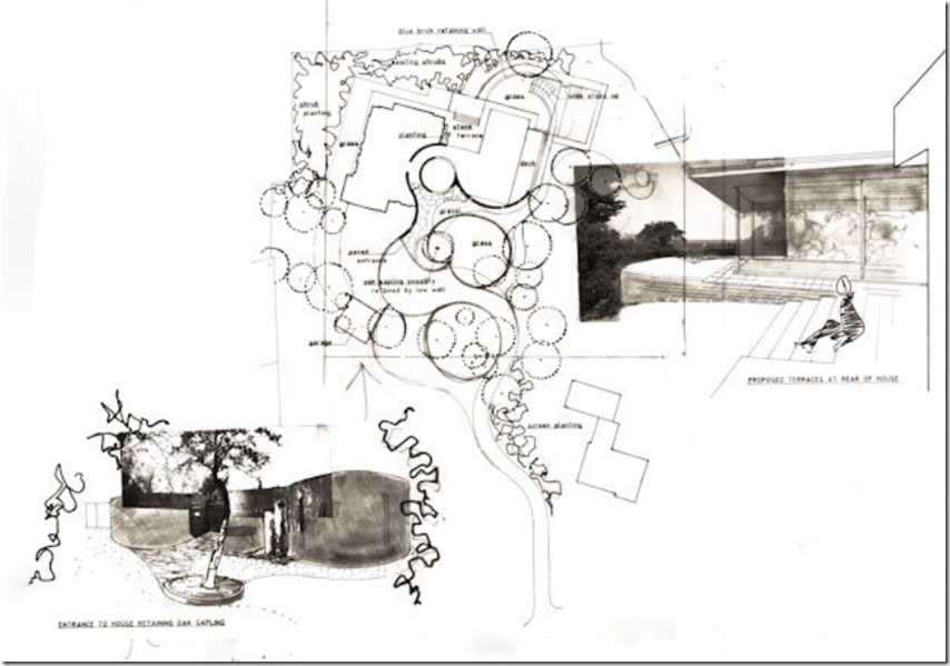
The “first third” reflects the building with the hardscape which tends to be kept simple, often with straight lines following the building profile for paths and possibly a patio. He then branches off into the garden into the “second third”, always at right angles, whether via a straight line or into a curve.
He then takes his lines and creates flowing curves to create his strong ground pattern. The pattern can be emphasised with shaped lawns, walls, hedges, rough grass shapes or planting beds. The planting reflects his philosophy of gradually moving to the more wild and naturalistic look as you progress into the final third of the garden.

